Agenda

agendalife.co

CREATIVE DIRECTOR: DYLAN BALLENTINE
ART DIRECTOR: CLARA ZHOU

The brand name “Agenda” draws inspiration from the founder, Brighton Keller, and her unique natural inclination to keep things meticulously organized. As a content creator specializing in hair care and organization, she sought to infuse this sense of structure into her hair care line, both in the brand name and its packaging design.

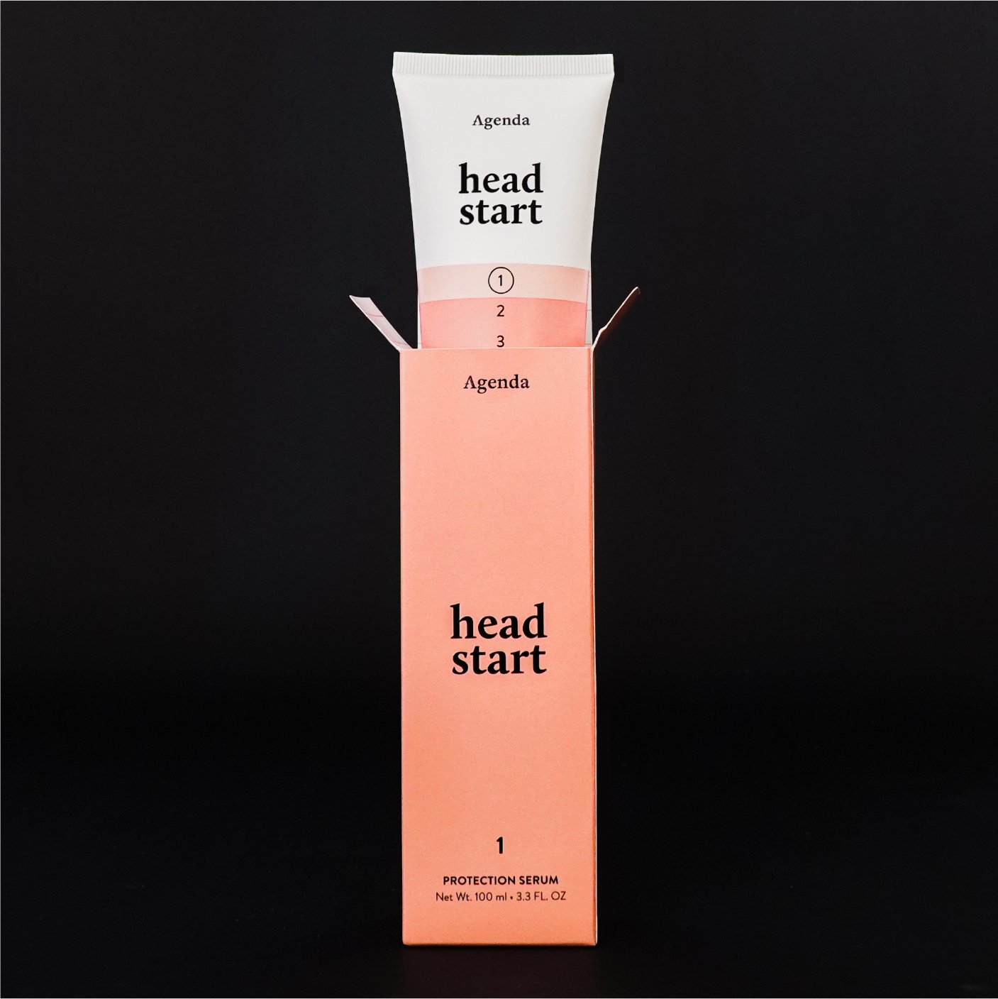
Each product was thoughtfully crafted to fit into a numbered system comprising five distinct product types. This numbered system serves to emphasize the specific purpose of each product. It functions as a to-do list in your planner, but for your hair care routine so that it’s streamlined, making it as straightforward and hassle-free as completing sequential tasks from 1 to 5.

LOGO DESIGN

The wordmark uses the FreightDisp Pro, which is a bold, feminine, and playful font that features solid letterforms. The understated boldness of the letterforms symbolically expresses the brand products’ mission of boosting hair volume.

The initial letter “A” was customized by shortening and separating the crossbar/horizontal bar from the right diagonal stem. This small adjustment symbolizes the concept of disruption: while Agenda’s products follow a structured system, the brand’s essence is centered around adding fun and personal flair to the haircare experience.

Previous
Previous

Jessica Wang

Next
Next

Future Kimonos